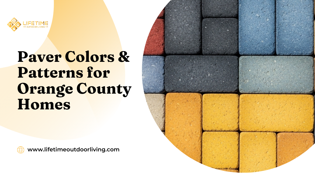
Choosing the Right Paver Colors & Patterns for Your Home: Expert Tips
Choosing the right paver colors and patterns shapes how your outdoor space looks and feels. The shades under your feet and the layout you select can either complement your home or make it feel disconnected. The best choice balances your home’s architecture, the surrounding landscape, and the function of each space.
When you upgrade with pavers, every detail matters. Cool grays and sleek lines can highlight a modern home, while warm earth tones and classic patterns bring out the character of Mediterranean or traditional styles. Patterns like herringbone or basketweave not only add visual interest but also improve durability in high-traffic areas.
At Lifetime Outdoor Living in Laguna Beach, you gain access to expert guidance and premium materials that make these decisions easier. With options ranging from concrete to natural stone, you can create a driveway, patio, or pool deck that blends seamlessly with your property while standing up to Orange County’s climate.
Why Colors And Patterns Matter In Outdoor Design
The way you choose paver colors and patterns directly affects how your outdoor space looks and functions. The right combination ensures your patio, driveway, or walkway complements your home’s exterior while remaining practical for daily use.
Boosting Curb Appeal And Home Value
Paver colors and patterns create a first impression before anyone steps inside your home. A driveway or patio that matches your home’s architecture and landscaping appears intentional and well-designed. This connection can make your property feel more cohesive and inviting.
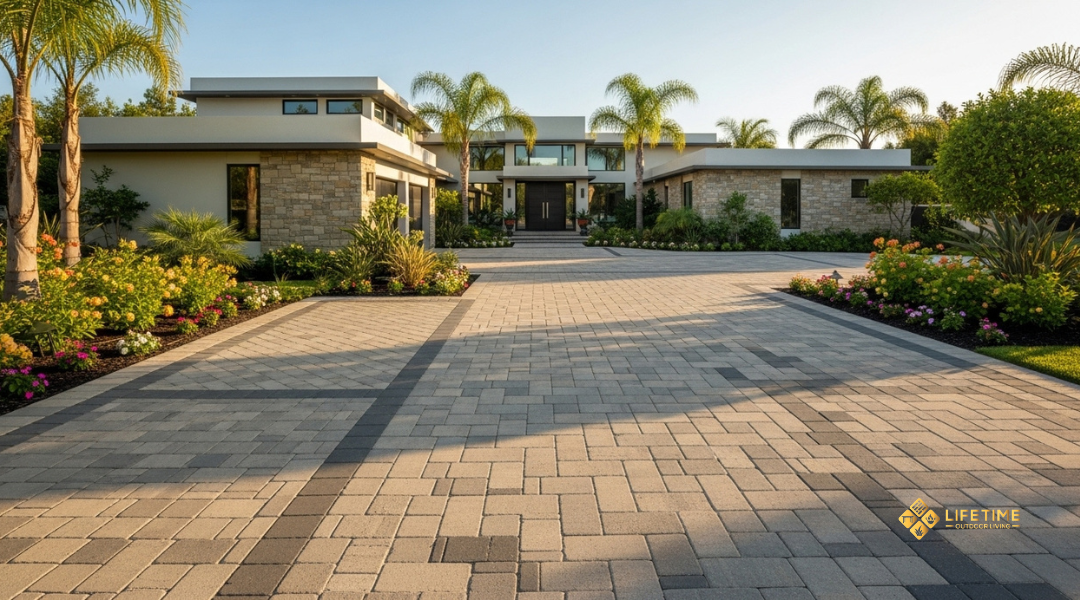
Neutral tones such as beige, gray, and tan blend easily with most exteriors, while bolder shades like charcoal or terracotta can highlight specific features. Pattern choices also influence perception—linear layouts can make narrow areas appear longer, while interlocking or herringbone designs add visual interest and dimension.
A well-chosen design doesn’t just look good; it can also affect resale value. Buyers often notice outdoor hardscapes as part of the overall property presentation. When your pavers complement the home’s style, they strengthen curb appeal and can make the space more attractive to potential buyers.
Balancing Style With Function And Maintenance
Beyond appearance, your color and pattern choices affect how easy it is to maintain your outdoor areas. Darker pavers hide dirt and stains better, making them practical for driveways or high-traffic walkways. However, they may fade more noticeably in direct sunlight. Lighter shades stay cooler underfoot but can show debris more quickly.
Patterns also play a functional role. A tightly interlocked pattern, such as herringbone, resists shifting under heavy use, making it ideal for driveways. Simpler running bond or stacked layouts are easier to install and maintain, often working well for patios or garden paths.
By weighing both aesthetics and upkeep, you can select a combination that looks appealing while staying practical for everyday living. This balance helps ensure your investment remains durable and attractive over time.
Key Factors To Consider In Orange County Homes
Your paver choices should balance appearance, durability, and consistency with the surroundings. The right color and pattern depend on how well they connect with your home’s architecture, the nearby landscape, and the local climate conditions.
Matching Pavers To Your Home’s Exterior And Landscape
Your home’s exterior materials and roof color set the tone for which paver shades work best. For example, red brick-style pavers complement red or terracotta roofs, while gray and charcoal tones pair well with darker roofing. Matching or contrasting thoughtfully creates cohesion without making the space look flat.
Your landscape also affects the choice. Light-colored pavers reflect heat and fit well around pool decks or open patios, while darker tones suit driveways and outdoor kitchens that need a more grounded look. Testing samples in natural sunlight helps you see how colors shift throughout the day.
Adding borders or accent patterns can separate large paved areas and tie them to nearby features such as stone walls, wooden decks, or garden beds. This approach prevents monotony and creates a smoother transition between hardscape and natural elements.
Coastal Climate And Neighborhood Style Influence
Orange County’s coastal climate brings strong sun exposure that can fade certain materials. Choosing UV-resistant options, such as specialized concrete blends, helps maintain color over time. Sealing your pavers also protects against stains from salt air and coastal moisture.
Neighborhood design plays a role as well. In Laguna Beach, many homes follow Mediterranean, Spanish, or modern coastal styles. Warm earth tones often enhance Mediterranean architecture, while sleek grays and blacks fit modern designs. Staying within the neighborhood’s character supports both curb appeal and property value.
Durability matters in high-traffic areas. Concrete pavers typically last 25–50 years, while natural stone can exceed 100 years with proper care. Balancing longevity with style ensures your outdoor space remains attractive and functional in Orange County’s environment.
Popular Paver Color Strategies
The way you choose paver colors directly affects how your outdoor space looks and feels. Color decisions often come down to whether you want a uniform appearance or a design with contrast and added detail.
Single-Tone Vs. Blended Tones
A single-tone paver creates a clean and consistent look. This option works well if you want a simple, modern style or if your home already has strong architectural details that you don’t want to compete with. Neutral shades like beige, gray, or charcoal often provide a timeless base.
Blended tones, on the other hand, combine multiple shades within each paver. This approach softens transitions and hides stains or wear more effectively. Blends often work well for patios, pool decks, or walkways where natural variation feels more inviting.
When deciding between the two, consider your home’s exterior. A single tone pairs best with busy siding or bold paint colors. Blended tones complement stucco, stone, or brick finishes by creating a more natural connection between house and landscape.
If you want flexibility, blended tones also give you more freedom to match furniture, plants, or future upgrades without clashing.
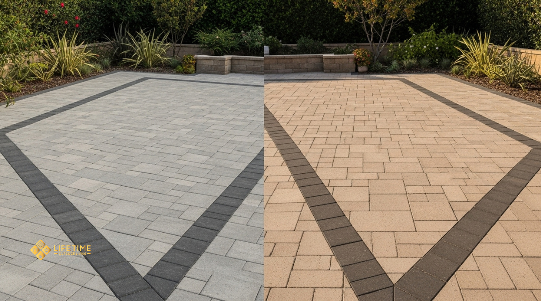
Borders And Accents For Contrast
Adding borders or accent pavers can change how the entire space feels. A border in a darker or lighter shade frames the area, giving patios and driveways a defined edge. This technique also helps guide the eye and can make small spaces appear larger.
Accent pavers can be used in patterns such as herringbone, basketweave, or running bond. By introducing a secondary color, you create visual interest without overwhelming the main surface.
For example:
| Main Field Color | Border/Accent Color | Effect |
|---|---|---|
| Light Gray | Charcoal | Strong contrast, modern look |
| Sandstone Beige | Brown/Tan Blend | Warm, natural tone |
| Terracotta Blend | Cream/Light Beige | Softer, Mediterranean style |
Borders also serve a practical role. They can protect edges from shifting and reduce wear in high-traffic areas. Choosing the right accent color ensures the design looks intentional rather than busy.
Paver Patterns That Work Best
The layout you choose affects both the look and the durability of your paved space. Some patterns emphasize timeless appeal and strength, while others create a clean, modern surface with fewer joints and a more open feel.
Classic Layouts: Running Bond, Basketweave, Herringbone
Traditional layouts remain popular because they balance style with practicality. A running bond pattern, where each row is offset by half a paver, gives you a simple, linear look that works well in walkways and patios. It creates a sense of length and is one of the easiest patterns to install.
The basketweave layout alternates pairs of horizontal and vertical pavers. This gives your surface a textured appearance that feels both decorative and structured. It works especially well in smaller areas where you want visual interest without overwhelming the space.
For driveways or high-traffic areas, the herringbone pattern stands out. Its interlocking design distributes weight evenly, which reduces shifting and increases durability. You can lay it at either 45 or 90 degrees, depending on whether you want a more dynamic or more formal look.
Contemporary Options: Modular And Large-Format Grids
Modern designs often use larger pavers and geometric layouts to create a sleek finish. Modular patterns combine different sizes in a repeating sequence, which helps break up large surfaces while still looking organized. This style works well in courtyards or patios where you want variety without losing balance.
Large-format grids use oversized pavers placed in straight lines with consistent spacing. This creates wide, uninterrupted surfaces that highlight clean edges and minimal joints. You can add gravel or grass between the pavers for contrast, giving the space a lighter, more open appearance.
These layouts suit contemporary homes because they emphasize simplicity and scale. They also reduce the number of seams, making maintenance easier and giving the surface a uniform finish.
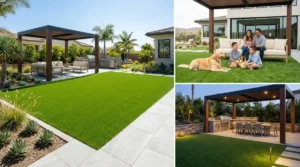
Practical Choices By Outdoor Space
The way you select paver colors and patterns should align with how each outdoor area is used and how it connects to the rest of your property. Durability, safety, and visual flow matter as much as style when making these decisions.
Driveways And Walkways
For driveways, you need pavers that balance strength with appearance. Darker tones such as charcoal or deep gray hide tire marks and stains better than lighter shades. A herringbone pattern works well here because it locks pavers tightly together, reducing movement under heavy vehicle weight.
Walkways benefit from lighter, more welcoming colors like beige, tan, or light gray. These shades make paths easier to see at night and create a softer transition into your yard. Consider using a running bond pattern for a clean, linear look that guides movement naturally.
You can also add a contrasting border in a darker color to define edges and improve safety. This not only enhances curb appeal but also helps visitors recognize pathways clearly.
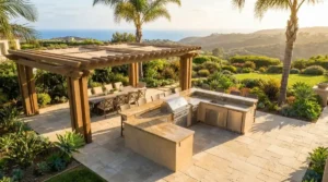
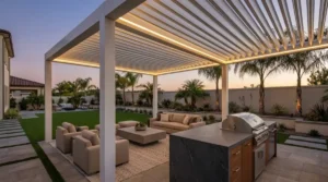
Patios And Pool Decks
Patios give you more flexibility in both color and layout. Warm earth tones such as sandstone, terracotta, or blended multi-color pavers create a comfortable setting for dining and relaxing. Patterns like basketweave or random modular layouts add visual interest without overwhelming the space.
For pool decks, safety and comfort are priorities. Lighter shades reflect heat, keeping surfaces cooler underfoot. Textured finishes or non-slip pavers reduce the risk of slipping when wet. Neutral tones like cream, light gray, or soft beige pair well with water features and landscaping.
You can also mix subtle color variations to mimic natural stone. This approach gives the area a more organic look while maintaining the durability of manufactured pavers.
Common Mistakes To Avoid
When planning your paver project, certain missteps can affect both appearance and long-term performance. Color choices can overwhelm the space, and ignoring site conditions can lead to structural issues that are costly to fix later.
Overcomplicating With Too Many Colors
Using multiple paver colors may seem appealing, but it often creates a cluttered look. When too many shades compete, the design loses focus and distracts from your home’s architecture.
A better approach is to limit your palette to two or three complementary colors. For example:
- Primary color: main field or base
- Accent color: borders or edging
- Optional highlight: small pattern or feature area
This method keeps the layout cohesive while still allowing for contrast and interest.
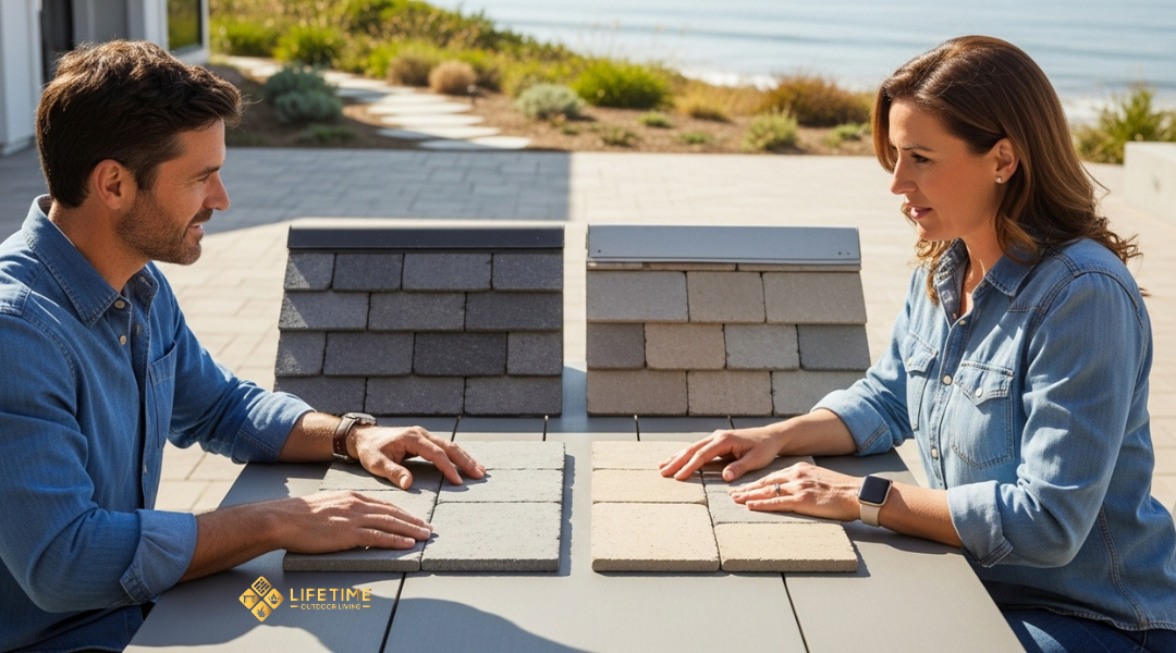
You should also test samples in natural daylight before installation. Colors can appear different under direct sun compared to shaded areas. By checking the tones throughout the day, you avoid surprises that could make the space feel mismatched.
Ignoring Scale, Slope, Or Drainage
Even the best color scheme can fail if the installation site is not properly prepared. A patio or driveway that lacks the right slope will collect water, leading to pooling, stains, or even shifting pavers.
You need to ensure the base has the correct grade for water runoff. Typically, a slope of about 1/8 inch per foot directs water away from the house without being noticeable.
Drainage also depends on the type of soil and base material. Using the wrong thickness or skipping compaction can cause settling. Over time, this creates uneven surfaces that are difficult to repair.
Finally, consider scale. Large-format pavers may overwhelm a small courtyard, while very small pieces can look busy in a large driveway. Matching paver size to the proportions of your space helps maintain balance and visual flow.
How Lifetime Outdoor Living Helps Homeowners Choose
You gain clarity by working with professionals who understand both design and function. Careful planning, proven materials, and skilled installation ensure your outdoor space looks intentional and lasts for years.
Expert Consultation And Local Project Experience
When you start planning, you receive direct guidance from specialists who know the Laguna Beach climate and architectural styles. This local knowledge helps you avoid color choices that fade quickly in coastal sun or clash with your home’s exterior.
You can review real project examples completed in nearby neighborhoods. Seeing how different blends perform in natural light, shade, and coastal weather allows you to make decisions with confidence.
Lifetime Outdoor Living also provides sample comparisons so you can view paver colors next to your siding, roofing, or outdoor furniture. Checking samples at different times of day gives you a realistic sense of how they will look once installed.
With this process, you reduce guesswork and select colors and patterns that fit your home’s setting rather than relying on generic design trends.
High-Quality Materials And Precise Installation
You benefit from durable pavers designed to withstand heavy use, changing weather, and sun exposure. Options include blends that resist fading, lighter tones that stay cooler underfoot, and multitone finishes that mask wear more effectively than solid colors.
Installation is handled with precision. Proper base preparation, joint alignment, and drainage planning prevent shifting and uneven surfaces. This ensures your patio or walkway remains functional and attractive over time.
Lifetime Outdoor Living follows manufacturer guidelines and uses proven methods to extend the lifespan of your hardscape. By combining quality materials with skilled craftsmanship, your finished project maintains both structural integrity and visual appeal.